7 Awesome Reference Charts and Diagrams
It’s long been said that a picture is worth a thousand words. When it comes to the world of technology and online marketing, diagrams like the ones below not only convey a concept but distill complex relationships into a digestible format. Some even tell a story in a single image.
Use these examples as a reference for ways you can better tell your own story.
Social Media Trends 2018 Infographic
by Falcon.io
 Why I like it: In addition to containing interesting and relevant data, infographics might be the internets perfect storytelling tool.
A well organized and clear infographic can convey a tremendous amount of information and tell a story that a viewer can digest in a short period of time.
In the days of short attention spans and everybody scans, the ability to get to the point, deliver a clear message, and improve retention and comprehension is worth a lot.
Infographics are a great medium to accomplish that. The downside is they can be complicated to build without muddying thigns up and generally require some graphics skills. Still, they’re a worthwhile addition to your arsenal.
Evolution of the Car – Line Chart With X/Y Axis
Why I like it: I stumbled across this while researching charts that show the law of accelerating returns. The x-axis timeline with the y-axis intervals (logarithmic scale) drives home how the powerful the law of accelerating returns is.
In this diagram, we can see that the time to go from the invention of the wheel to the internal combustion engine was nearly 12,000 years. The time to go from the internal combustion engine to self-driving cars is about 120 years. That second jump is just 1% of the time of the first!
Facebook Page vs Facebook Group

Simple side-by-side comparisons are a powerful way to clarify things that are often confusing to end users. The key is to keep it simple and remember that your audience is coming to you for clarity.
In this graphic, the benefits or downside of each is also clear.
Social Media Channels as a Color Chart
by ethority
Why I like it: Wheel graphics are a very effective way to communicate complex ideas. In this graphic, we get a sense of how many social networks and related services are out there. We also get a sense of the relationship between those networks and services. And since those relationships form a continuum, the wheel is a particularly good format to convey all that info.
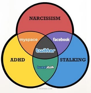
The Dark Side of Social Media
by Despair.com
Why I like it: While this graphic is a bit dated, it takes a simple approach (the ven diagram) and mixes in a little humor to define the landscape of what were the popular social networks at the time.
Ven diagrams are used primarily to clarify the intersection of independent but related things. Where they shine however is in instances like this where you want to show the intersection of multiple entities and how they relate.
Active Social Media Users Globally By Channel
by Hootsuite
Why I like it: The old bar graph provides an easy visual reference for understanding dominance or highlighting a high-level side-by-side comparison.
From this chart, it’s clear that Facebook is the dominant social network in terms of active users. I use bar charts for 1st level decisions but it’s important to always ask the next question. For example, in the case of this graphic, it would be easy to assume that with Facebook’s dominance it’s important to be on that network. But the 2nd level question, which requires additional research, is whether or not that is where YOUR audience is, a key thing to understand if you want to sell.
Photo-sharing Site Comparison
by Chris Silver
Why I like it: This chart is a bit dated, but it makes a good example of a matrix-based approach. A viewer can decide what criteria is most important to them, and quickly eliminate or dial in on the right service to match their needs.
While this graphic was originally borrowed from Chris Silver I might need to create a more modern version of it. Image SEO is still important and the exercise of creating it will tell us a lot about what photosharing sites might be useful to that end.


